

Case Study // 2024
How i turned a good idea into a great one and helped land the investor buy-in
Initially i was hired to improve the already existing UI designs for an app that was supposed to be a Tiktok clone for livestreamed concerts. But i ended up reshaping the business model and creating a high-fidelity prototype that helped the founder secure funding and move into development.
The project
I was brought on to design an app experience similar to TikTok. an endless feed of short-form videos. The idea: musicians post teaser videos to promote their upcoming live-streamed concerts and performances, and fans can buy tickets to eventually watch the live stream directly through the app.

The challenge
While the core idea was clear, the project had hit a wall. The client had existing designs but struggled to gain traction with investors. One major hurdle: the app seemed too similar to existing platforms like TikTok, Instagram, and YouTube. And those even already offer some similar concepts in their own platform. Why would artists switch to a new platform? And more importantly, why would the audience even come to the platform?
Rethinking the concept
My first reaction: Who needs another Tiktok clone? The idea was good and the intentions were noble, but the value proposition wasn’t strong enough. So I took a step back and started digging.
The solution
After doing some research and thoroughly looking into all the competiton, i came up with a proposal
Focus on delivering the best experience for the niche
While the app would offer similar features to other platforms, it was built specifically for a niche: livestreamed concerts and performances. That meant everything. From the interface to the business model — could be tailored to what artists and fans in this space actually need. With better earning potential and a clear purpose, we could stand out by doing one thing really well.
Allow browsing and exploring, rather than just scrolling
The initial idea of having an endless scroll of teaser clips sounded good in theory, but i soon realised that it doesn’t work well for the concept. We needed a more organised way to browse and explore the artists, genres and performances. That's why I added simple ways to explore. Search by artist, browse by genre, and personalised recommendations. Now users can actually discover shows they'll love instead of just passively scrolling.
Integrate as an extension instead of being direct competition
Instead of competing with platforms like TikTok or Instagram, the idea was to create something that integrates with them. Kinda like CapCut made editing videos more fun than the regular video editing that Tiktok offers. Artists wouldn’t need to build a new following from scratch. Instead, they could connect their existing social media accounts like TikTok, YouTube, and Instagram and focus on just the live stream performances. This made the product feel more like a helpful extension, not a rival.
The execution
With the new concept in place, we decided to build a prototype in Figma, so it could be used as a proof of concept at investor pitches. The quality and functionality of the prototype should be already very close to the final product, so it could be used once an investor was found.
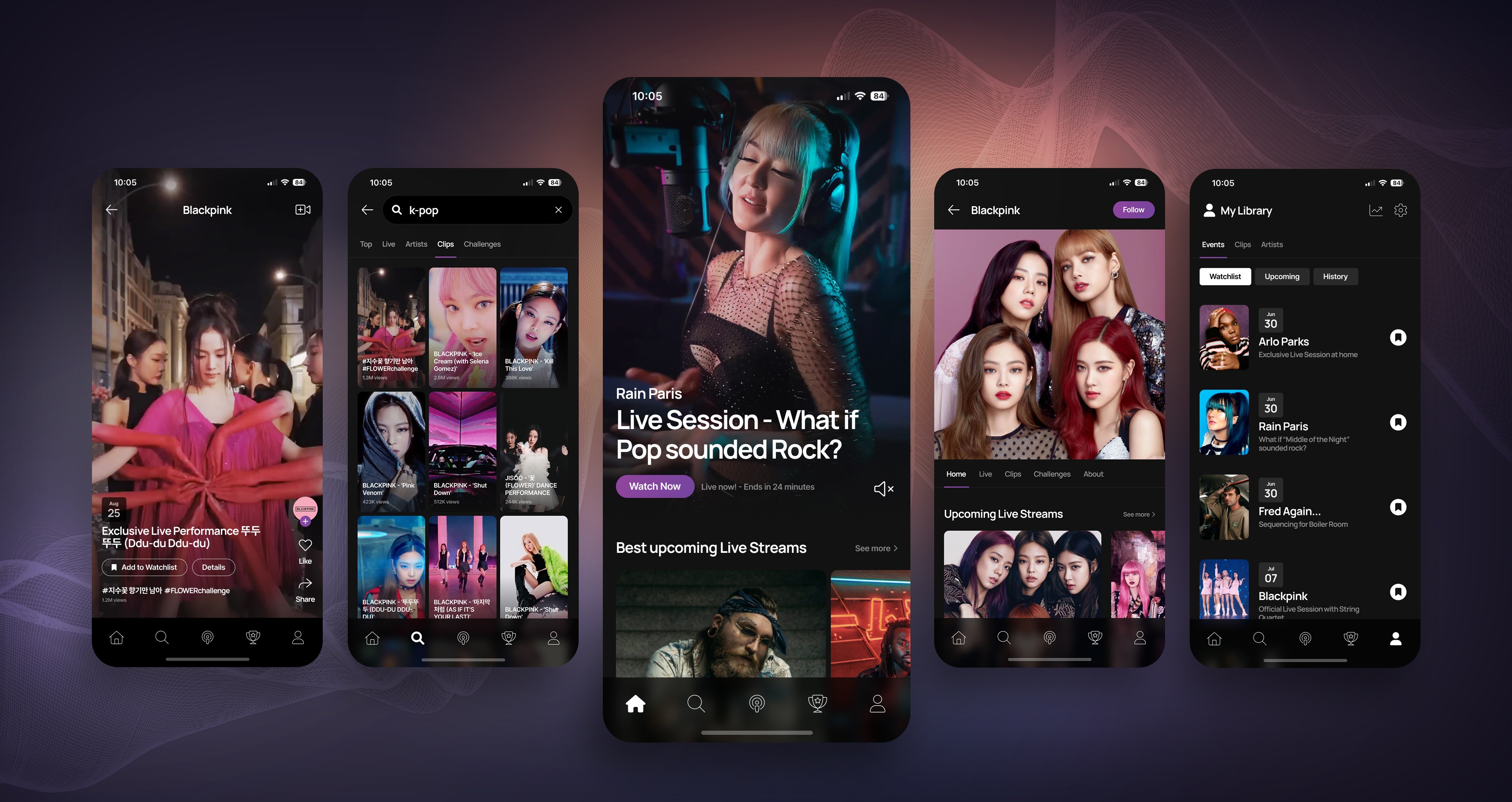
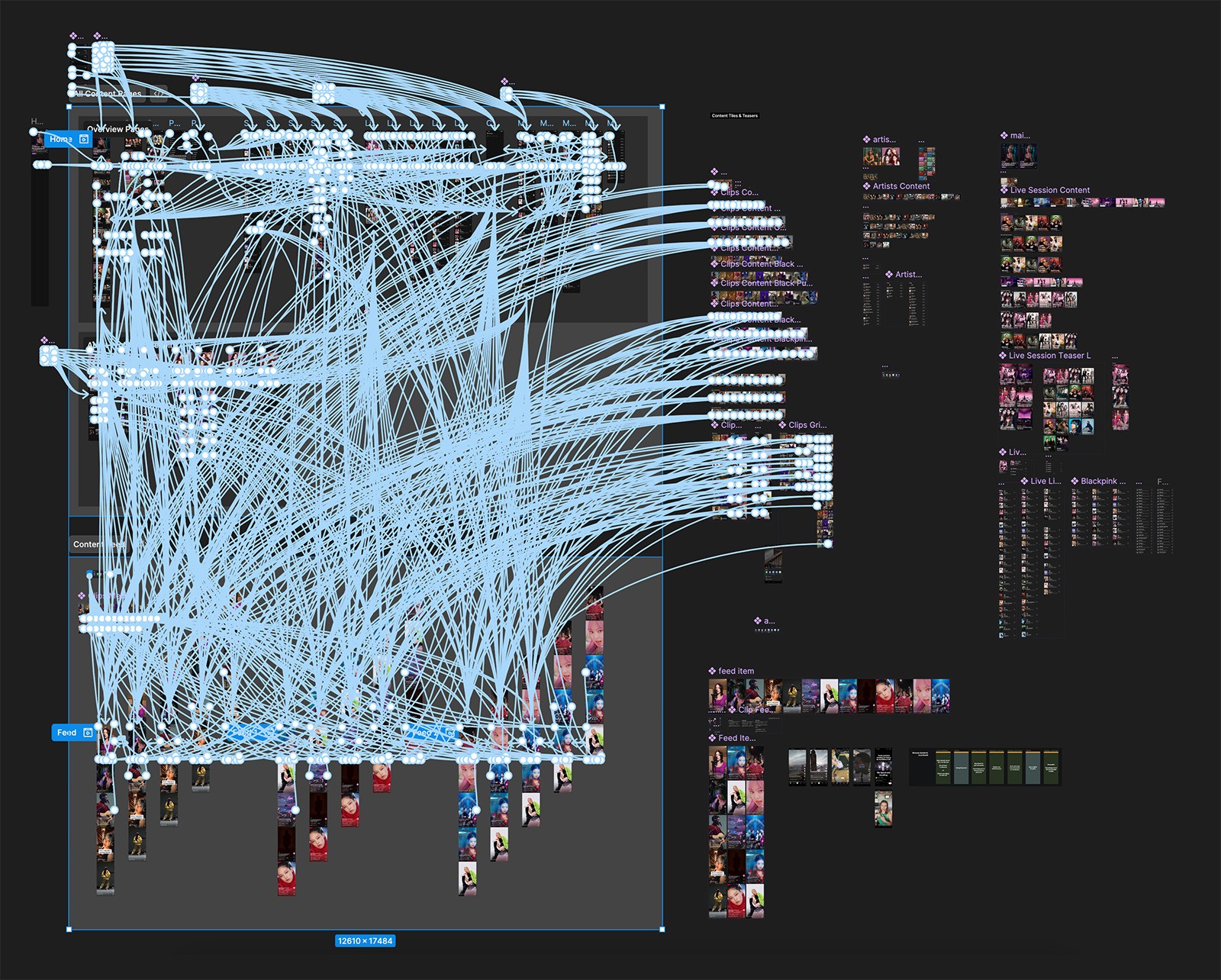
Super high fidelity prototype as proof of concept
I designed a high-fidelity prototype in Figma that looked and felt like a real product. It helped the client clearly communicate the idea to investors — not just with words, but through a fully clickable, visually polished experience.
UX aligned with familiar social patterns
The user experience was built around patterns people already know from apps like TikTok, Instagram and Spotify. This made it easy for new users to understand how the app works right away, reducing friction and speeding up onboarding.
Developer-ready design handoff
The prototype wasn’t just for show - it was built with real-world implementation in mind. All components were organised, labeled, and structured for a smooth handoff to developers once funding was secured.
The outcome
The new concept and prototype helped the client secure initial funding, and the designs were handed over to developers to begin building the app.
Key wins

Strategic product pivot
I transformed the concept from a TikTok clone into a complementary tool that works with existing social platforms - making the idea more realistic, user-friendly, and investor-ready.
Investor-ready prototype
I delivered a polished, clickable Figma prototype that clearly communicated the value of the app, helping the client secure funding to move into development.
Design built for launch
The UI and UX weren’t just beautiful — they were practical. The prototype followed real social app patterns and was fully prepared for a clean developer handoff.

Related projects
Case Study
Viessmann Website Builder
How i unified Viessmann’s B2C web experiences in all 43 of their market countries and dramatically improved the usability and conversion rate. In the end we won an award for “Best Redesign”
Check it out

Showcase
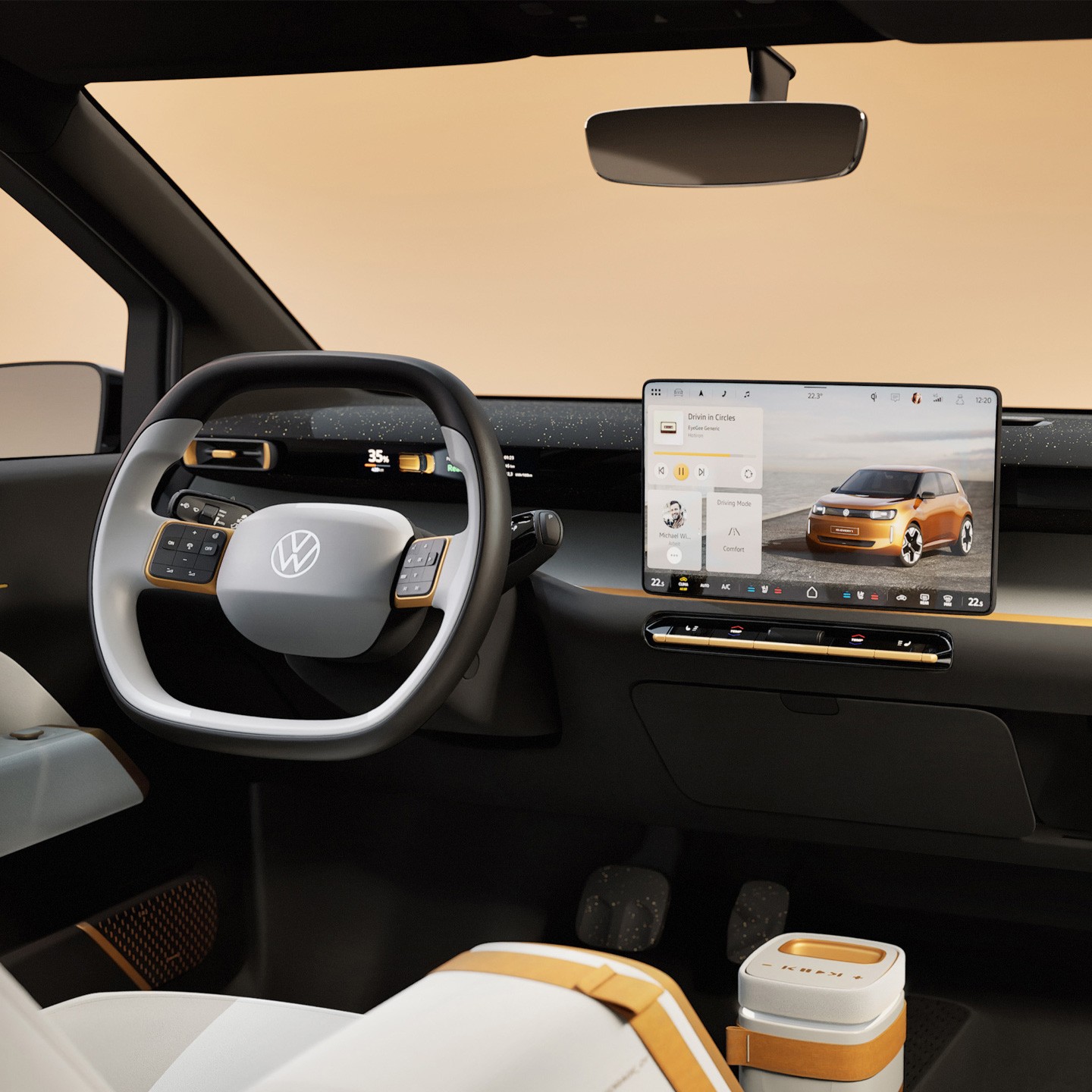
Volkswagen HMI Design
I was part of two design teams. First i worked on an Infotainment System tailored for the Chinese market. Later i moved over to the HMI design team for the series production in their entire fleet.
Check it out
Ready to take your design to the next level?
Let’s make it happen


© 2025 Mathias Mahling -
Impressum & Datenschutz

Case Study // 2024
How i turned a good idea into a great one and helped land the investor buy-in
Initially i was hired to improve the already existing UI designs for an app that was supposed to be a Tiktok clone for livestreamed concerts. But i ended up reshaping the business model and creating a high-fidelity prototype that helped the founder secure funding and move into development.
The project
I was brought on to design an app experience similar to TikTok. an endless feed of short-form videos. The idea: musicians post teaser videos to promote their upcoming live-streamed concerts and performances, and fans can buy tickets to eventually watch the live stream directly through the app.
The challenge
While the core idea was clear, the project had hit a wall. The client had existing designs but struggled to gain traction with investors. One major hurdle: the app seemed too similar to existing platforms like TikTok, Instagram, and YouTube. And those even already offer some similar concepts in their own platform. Why would artists switch to a new platform? And more importantly, why would the audience even come to the platform?
Rethinking the concept
My first reaction: Who needs another Tiktok clone? The idea was good and the intentions were noble, but the value proposition wasn’t strong enough. So I took a step back and started digging.
The solution
After doing some research and thoroughly looking into all the competiton, i came up with a proposal
Focus on delivering the best experience for the niche
While the app would offer similar features to other platforms, it was built specifically for a niche: livestreamed concerts and performances. That meant everything. From the interface to the business model — could be tailored to what artists and fans in this space actually need. With better earning potential and a clear purpose, we could stand out by doing one thing really well.
Allow browsing and exploring, rather than just scrolling
The initial idea of having an endless scroll of teaser clips sounded good in theory, but i soon realised that it doesn’t work well for the concept. We needed a more organised way to browse and explore the artists, genres and performances. That's why I added simple ways to explore. Search by artist, browse by genre, and personalised recommendations. Now users can actually discover shows they'll love instead of just passively scrolling.
Integrate as an extension instead of being direct competition
Instead of competing with platforms like TikTok or Instagram, the idea was to create something that integrates with them. Kinda like CapCut made editing videos more fun than the regular video editing that Tiktok offers. Artists wouldn’t need to build a new following from scratch. Instead, they could connect their existing social media accounts like TikTok, YouTube, and Instagram and focus on just the live stream performances. This made the product feel more like a helpful extension, not a rival.
The execution
With the new concept in place, we decided to build a prototype in Figma, so it could be used as a proof of concept at investor pitches. The quality and functionality of the prototype should be already very close to the final product, so it could be used once an investor was found.
Super high fidelity prototype as proof of concept
I designed a high-fidelity prototype in Figma that looked and felt like a real product. It helped the client clearly communicate the idea to investors — not just with words, but through a fully clickable, visually polished experience.
UX aligned with familiar social patterns
The user experience was built around patterns people already know from apps like TikTok, Instagram and Spotify. This made it easy for new users to understand how the app works right away, reducing friction and speeding up onboarding.
Developer-ready design handoff
The prototype wasn’t just for show - it was built with real-world implementation in mind. All components were organised, labeled, and structured for a smooth handoff to developers once funding was secured.
The outcome
The new concept and prototype helped the client secure initial funding, and the designs were handed over to developers to begin building the app.
Key wins
Strategic product pivot
I transformed the concept from a TikTok clone into a complementary tool that works with existing social platforms - making the idea more realistic, user-friendly, and investor-ready.
Investor-ready prototype
I delivered a polished, clickable Figma prototype that clearly communicated the value of the app, helping the client secure funding to move into development.
Design built for launch
The UI and UX weren’t just beautiful — they were practical. The prototype followed real social app patterns and was fully prepared for a clean developer handoff.
Related projects
Case Study
Viessmann Website Builder
How i unified Viessmann’s B2C web experiences in all 43 of their market countries and dramatically improved the usability and conversion rate. In the end we won an award for “Best Redesign”
Check it out
Showcase
Volkswagen HMI Design
I was part of two design teams. First i worked on an Infotainment System tailored for the Chinese market. Later i moved over to the HMI design team for the series production in their entire fleet.
Check it out
Ready to take your design to the next level?
Let’s make it happen

© 2025 Mathias Mahling -
Impressum & Datenschutz
Case Study // 2024
How i turned a good idea into a great one and helped land the investor buy-in
Initially i was hired to improve the already existing UI designs for an app that was supposed to be a Tiktok clone for livestreamed concerts. But i ended up reshaping the business model and creating a high-fidelity prototype that helped the founder secure funding and move into development.
The project
I was brought on to design an app experience similar to TikTok. an endless feed of short-form videos. The idea: musicians post teaser videos to promote their upcoming live-streamed concerts and performances, and fans can buy tickets to eventually watch the live stream directly through the app.
The challenge
While the core idea was clear, the project had hit a wall. The client had existing designs but struggled to gain traction with investors. One major hurdle: the app seemed too similar to existing platforms like TikTok, Instagram, and YouTube. And those even already offer some similar concepts in their own platform. Why would artists switch to a new platform? And more importantly, why would the audience even come to the platform?
Rethinking the concept
My first reaction: Who needs another Tiktok clone? The idea was good and the intentions were noble, but the value proposition wasn’t strong enough. So I took a step back and started digging.
The solution
After doing some research and thoroughly looking into all the competiton, i came up with a proposal
Focus on delivering the best experience for the niche
While the app would offer similar features to other platforms, it was built specifically for a niche: livestreamed concerts and performances. That meant everything. From the interface to the business model — could be tailored to what artists and fans in this space actually need. With better earning potential and a clear purpose, we could stand out by doing one thing really well.
Allow browsing and exploring, rather than just scrolling
The initial idea of having an endless scroll of teaser clips sounded good in theory, but i soon realised that it doesn’t work well for the concept. We needed a more organised way to browse and explore the artists, genres and performances. That's why I added simple ways to explore. Search by artist, browse by genre, and personalised recommendations. Now users can actually discover shows they'll love instead of just passively scrolling.
Integrate as an extension instead of being direct competition
Instead of competing with platforms like TikTok or Instagram, the idea was to create something that integrates with them. Kinda like CapCut made editing videos more fun than the regular video editing that Tiktok offers. Artists wouldn’t need to build a new following from scratch. Instead, they could connect their existing social media accounts like TikTok, YouTube, and Instagram and focus on just the live stream performances. This made the product feel more like a helpful extension, not a rival.
The execution
With the new concept in place, we decided to build a prototype in Figma, so it could be used as a proof of concept at investor pitches. The quality and functionality of the prototype should be already very close to the final product, so it could be used once an investor was found.
Super high fidelity prototype as proof of concept
I designed a high-fidelity prototype in Figma that looked and felt like a real product. It helped the client clearly communicate the idea to investors — not just with words, but through a fully clickable, visually polished experience.
UX aligned with familiar social patterns
The user experience was built around patterns people already know from apps like TikTok, Instagram and Spotify. This made it easy for new users to understand how the app works right away, reducing friction and speeding up onboarding.
Developer-ready design handoff
The prototype wasn’t just for show - it was built with real-world implementation in mind. All components were organised, labeled, and structured for a smooth handoff to developers once funding was secured.
The outcome
The new concept and prototype helped the client secure initial funding, and the designs were handed over to developers to begin building the app.
Key wins
Strategic product pivot
I transformed the concept from a TikTok clone into a complementary tool that works with existing social platforms - making the idea more realistic, user-friendly, and investor-ready.
Investor-ready prototype
I delivered a polished, clickable Figma prototype that clearly communicated the value of the app, helping the client secure funding to move into development.
Design built for launch
The UI and UX weren’t just beautiful — they were practical. The prototype followed real social app patterns and was fully prepared for a clean developer handoff.
Related projects
Case Study
Viessmann Website Builder
How i unified Viessmann’s B2C web experiences in all 43 of their market countries and dramatically improved the usability and conversion rate. In the end we won an award for “Best Redesign”
Check it out
Showcase
Volkswagen HMI Design
I was part of two design teams. First i worked on an Infotainment System tailored for the Chinese market. Later i moved over to the HMI design team for the series production in their entire fleet.
Check it out
Ready to take your design to the next level?
Let’s make it happen
© 2025 Mathias Mahling -
Impressum & Datenschutz

Case Study // 2024
How i turned a good idea into a great one and helped land the investor buy-in
Initially i was hired to improve the already existing UI designs for an app that was supposed to be a Tiktok clone for livestreamed concerts. But i ended up reshaping the business model and creating a high-fidelity prototype that helped the founder secure funding and move into development.
The project
I was brought on to design an app experience similar to TikTok. an endless feed of short-form videos. The idea: musicians post teaser videos to promote their upcoming live-streamed concerts and performances, and fans can buy tickets to eventually watch the live stream directly through the app.
The challenge
While the core idea was clear, the project had hit a wall. The client had existing designs but struggled to gain traction with investors. One major hurdle: the app seemed too similar to existing platforms like TikTok, Instagram, and YouTube. And those even already offer some similar concepts in their own platform. Why would artists switch to a new platform? And more importantly, why would the audience even come to the platform?
Rethinking the concept
My first reaction: Who needs another Tiktok clone? The idea was good and the intentions were noble, but the value proposition wasn’t strong enough. So I took a step back and started digging.
The solution
After doing some research and thoroughly looking into all the competiton, i came up with a proposal
Focus on delivering the best experience for the niche
While the app would offer similar features to other platforms, it was built specifically for a niche: livestreamed concerts and performances. That meant everything. From the interface to the business model — could be tailored to what artists and fans in this space actually need. With better earning potential and a clear purpose, we could stand out by doing one thing really well.
Allow browsing and exploring, rather than just scrolling
The initial idea of having an endless scroll of teaser clips sounded good in theory, but i soon realised that it doesn’t work well for the concept. We needed a more organised way to browse and explore the artists, genres and performances. That's why I added simple ways to explore. Search by artist, browse by genre, and personalised recommendations. Now users can actually discover shows they'll love instead of just passively scrolling.
Integrate as an extension instead of being direct competition
Instead of competing with platforms like TikTok or Instagram, the idea was to create something that integrates with them. Kinda like CapCut made editing videos more fun than the regular video editing that Tiktok offers. Artists wouldn’t need to build a new following from scratch. Instead, they could connect their existing social media accounts like TikTok, YouTube, and Instagram and focus on just the live stream performances. This made the product feel more like a helpful extension, not a rival.
The execution
With the new concept in place, we decided to build a prototype in Figma, so it could be used as a proof of concept at investor pitches. The quality and functionality of the prototype should be already very close to the final product, so it could be used once an investor was found.
Super high fidelity prototype as proof of concept
I designed a high-fidelity prototype in Figma that looked and felt like a real product. It helped the client clearly communicate the idea to investors — not just with words, but through a fully clickable, visually polished experience.
UX aligned with familiar social patterns
The user experience was built around patterns people already know from apps like TikTok, Instagram and Spotify. This made it easy for new users to understand how the app works right away, reducing friction and speeding up onboarding.
Developer-ready design handoff
The prototype wasn’t just for show - it was built with real-world implementation in mind. All components were organised, labeled, and structured for a smooth handoff to developers once funding was secured.
The outcome
The new concept and prototype helped the client secure initial funding, and the designs were handed over to developers to begin building the app.
Key wins
Strategic product pivot
I transformed the concept from a TikTok clone into a complementary tool that works with existing social platforms - making the idea more realistic, user-friendly, and investor-ready.
Investor-ready prototype
I delivered a polished, clickable Figma prototype that clearly communicated the value of the app, helping the client secure funding to move into development.
Design built for launch
The UI and UX weren’t just beautiful — they were practical. The prototype followed real social app patterns and was fully prepared for a clean developer handoff.
Related projects
Case Study
Viessmann Website Builder
How i unified Viessmann’s B2C web experiences in all 43 of their market countries and dramatically improved the usability and conversion rate. In the end we won an award for “Best Redesign”
Check it out
Showcase
Volkswagen HMI Design
I was part of two design teams. First i worked on an Infotainment System tailored for the Chinese market. Later i moved over to the HMI design team for the series production in their entire fleet.
Check it out
Ready to take your design to the next level?
Let’s make it happen

© 2025 Mathias Mahling -
Impressum & Datenschutz
Case Study // 2024
How i turned a good idea into a great one and helped land the investor buy-in
Initially i was hired to improve the already existing UI designs for an app that was supposed to be a Tiktok clone for livestreamed concerts. In the end i didn’t just create a super-hifi prototype of the entire app, but also reshaped the business model and helped the founder secure funding.
The project
I was brought on to design an app experience similar to TikTok. an endless feed of short-form videos. The idea: musicians post teaser videos to promote their upcoming live-streamed concerts and performances, and fans can buy tickets to eventually watch the live stream directly through the app.
The challenge
While the core idea was clear, the project had hit a wall. The client had existing designs but struggled to gain traction with investors. One major hurdle: the app seemed too similar to existing platforms like TikTok, Instagram, and YouTube. And those even already offer some similar concepts in their own platform. Why would artists switch to a new platform? And more importantly, why would the audience even come to the platform?
Rethinking the concept
My first reaction: Who needs another Tiktok clone? The idea was good and the intentions were noble, but the value proposition wasn’t strong enough. So I took a step back and started digging.
The solution
After doing some research, asking around in some music fan communities and thoroughly looking into all the competition, i came up with a new proposal.
Focus on delivering the best experience for the niche
While the app would offer similar features to other platforms, it was built specifically for a niche: livestreamed concerts and performances. That meant everything could be tailored exactly to what artists and fans in this space actually need. From the interface to the business model. With better earning potential and a clear purpose, we could stand out by doing one thing really well. Kinda like CapCut made editing videos more fun than the regular video editing that Tiktok offers and eventually was acquired by Tiktok as a fun extension.
Allow browsing and exploring, rather than just scrolling
The initial idea of having an endless scroll of teaser clips sounded good in theory, but i soon realised that it doesn’t work well for the concept. We needed a more organised way to browse and explore the artists, genres and performances. That's why I added simple ways to explore. Search by artist, browse by genre, and personalised recommendations. Now users can actually discover shows they'll love instead of just passively scrolling.
Integrate as an extension instead of being direct competition
Instead of competing with platforms like TikTok or Instagram, the idea was to create something that integrates with them. Artists wouldn’t need to build a new following from scratch. Instead, they could connect their existing social media accounts like TikTok, YouTube, and Instagram and focus on just the live stream performances. This made the product feel more like a fun, helpful extension to the existing platforms, not a rival.
The execution
With the new concept in place, we decided to build a prototype in Figma, so it could be used as a proof of concept at investor pitches. The quality and functionality of the prototype should be already very close to the final product, so it could be used once an investor was found.
Super high fidelity prototype as proof of concept
I designed a high-fidelity prototype in Figma that looked and felt like a real product. It helped the client clearly communicate the idea to investors — not just with words, but through a fully clickable, visually polished experience.
UX aligned with familiar social patterns
The user experience was built around patterns people already know from apps like TikTok, Instagram and Spotify. This made it easy for new users to understand how the app works right away, reducing friction and speeding up onboarding.
Developer-ready design handoff
The prototype wasn’t just for show - it was built with real-world implementation in mind. All components were organised, labeled, and structured for a smooth handoff to developers once funding was secured.
The outcome
The new concept and prototype helped the client secure initial funding, and the designs were handed over to developers to begin building the app.
Key wins
Strategic product pivot
I transformed the concept from a TikTok clone into a complementary tool that works with existing social platforms - making the idea more realistic, user-friendly, and investor-ready.
Investor-ready prototype
I delivered a polished, clickable Figma prototype that clearly communicated the value of the app, helping the client secure funding to move into development.
Design built for launch
The UI and UX weren’t just beautiful — they were practical. The prototype followed real social app patterns and was fully prepared for a clean developer handoff.
Related projects
Case Study
Viessmann Website Builder
How i unified Viessmann’s B2C web experiences in all 43 of their market countries and dramatically improved the usability and conversion rate. In the end we won an award for “Best Redesign”
Check it out
Showcase
Volkswagen HMI Design
I was part of two design teams. First i worked on an Infotainment System tailored for the Chinese market. Later i moved over to the HMI design team for the series production in their entire fleet.
Check it out
Ready to take your design to the next level?
Let’s make it happen
© 2025 Mathias Mahling -
Impressum & Datenschutz