


Case Study // 2022
How i crafted Viessmann’s redesign that won them an award
Viessmann hired me as one-man-show Lead Product Designer to build a flexible web toolkit that anyone in their 43 market countries could use to create beautiful, flexible, yet brand-consistent websites.
The client
About Viessmann
The Viessmann Group is a German company that manufactures heating and cooling systems. They have 22 factories in 12 countries and sell their products in 74 countries through sales offices, agencies, and partners around the world.
The project
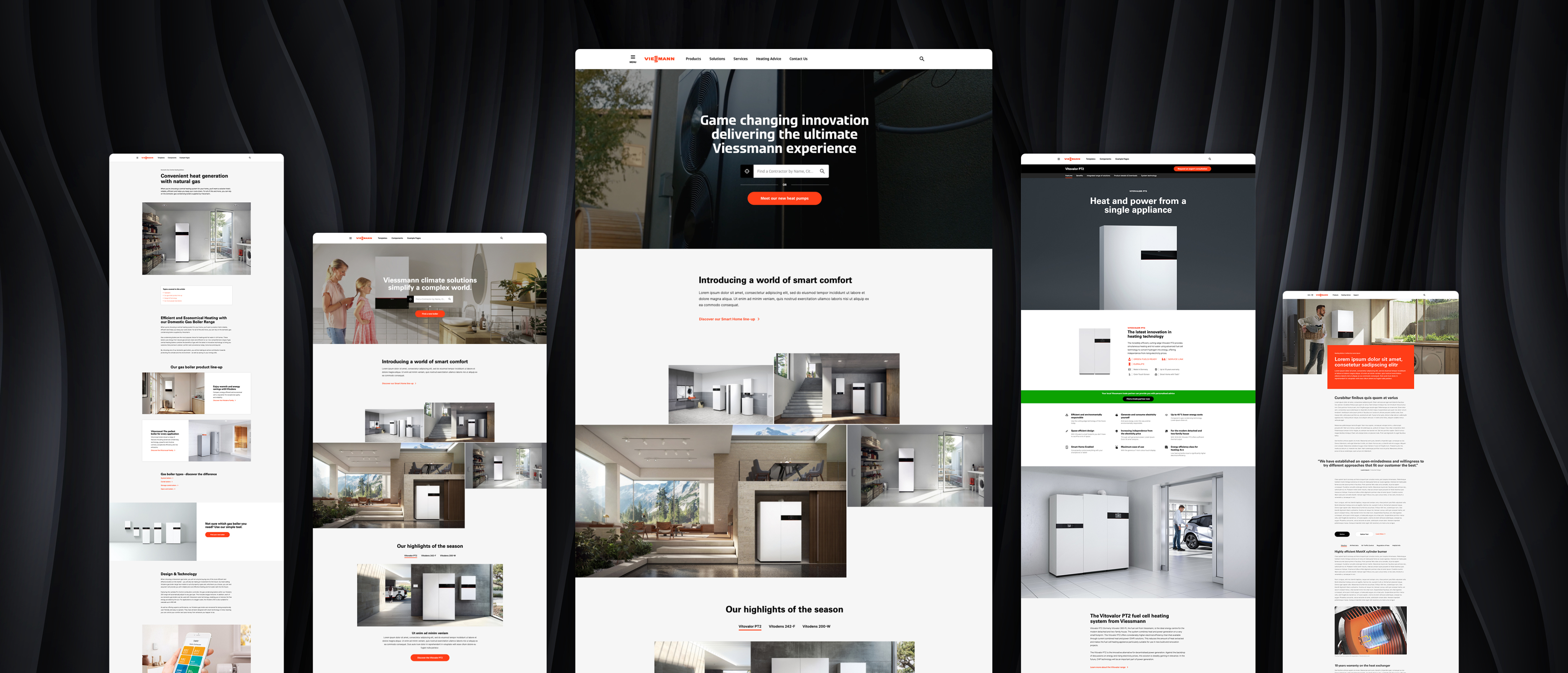
Over 2.5 years, we redesigned Viessmann’s websites for 4 countries. We started with an MVP for the UK, which we used for extensive user testing on a live product. Insights from this launch helped us create a significantly improved version for the USA and Canada. We then fine-tuned everything further to deliver the final, optimised version for Viessmann’s key market: Germany.
My role and my responsibilities
As the only UX/UI designer, I was responsible for all user research, wireframing, prototyping, and user testing. I designed around 30 page templates that served as a reference for content editors and built the entire design system from scratch, continuously updating it. I wrote comprehensive documentation for developers, closely supported the development process, and handled quality assurance by testing all final components. Additionally, I created a detailed online user guide to help editors effectively use the components I designed.
Main tools


The initial problems
Since we were essentially redesigning 40+ different websites in 40+ different countries, there was a whole multitude of problems that all needed resolving. Here i will only outline a few of the biggest ones.
General design inconsistency across the 40+ different websites
Viessmann’s website ecosystem was complex and fragmented. Each country created its own content and assets, often without design support, leading to inconsistent quality. There were multiple separate websites for B2B, B2C, and product-specific microsites, all with different priorities. For users, it was difficult to find and understand product information, and installers spent too much time searching for technical details.
Overloaded menu
There was a general lack of structure and consistency on Viessmann’s old website. Being a large company with many different branches - the amount of content they had to handle outgrew their old menu structure and made it hard to find anything.
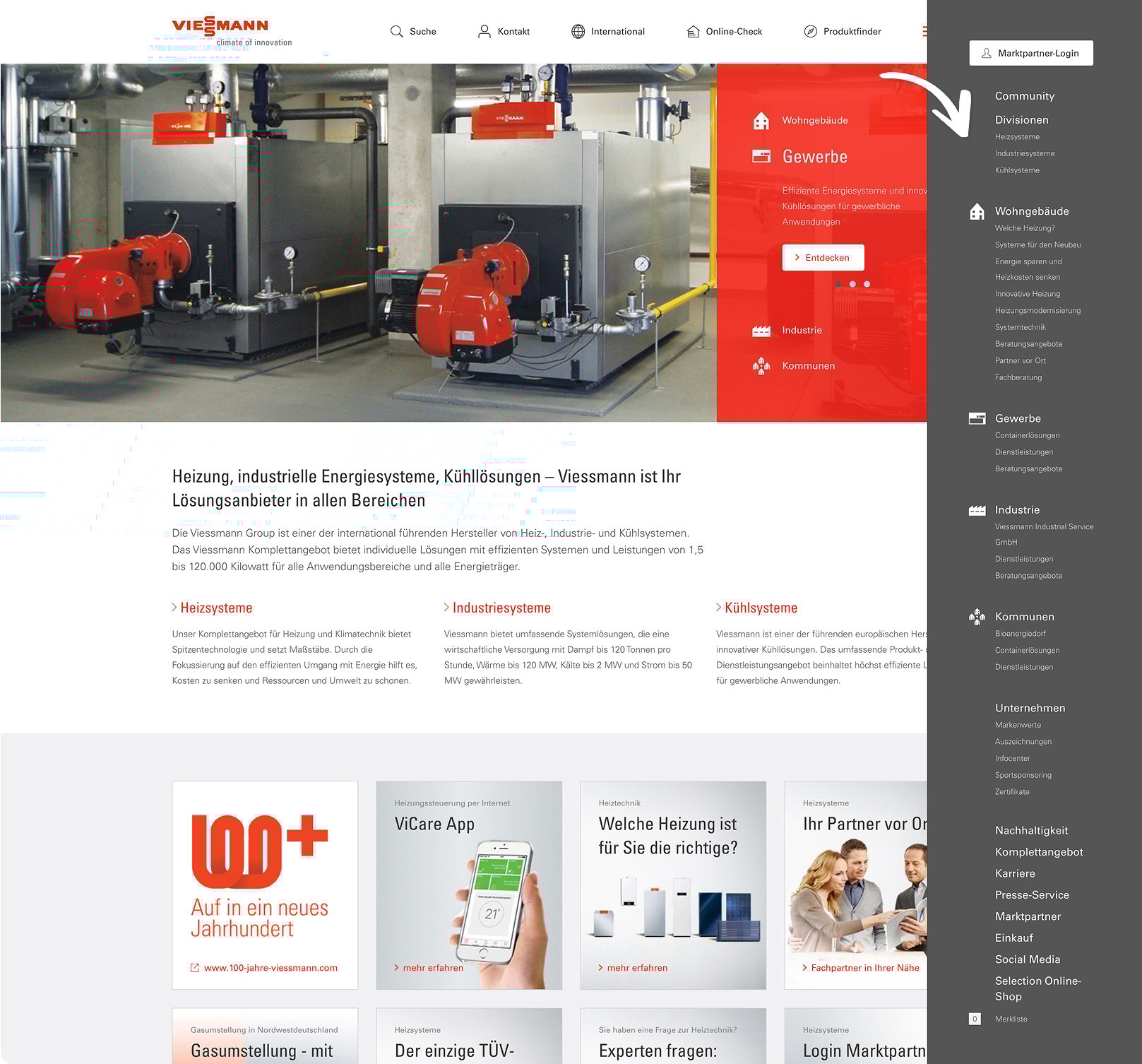
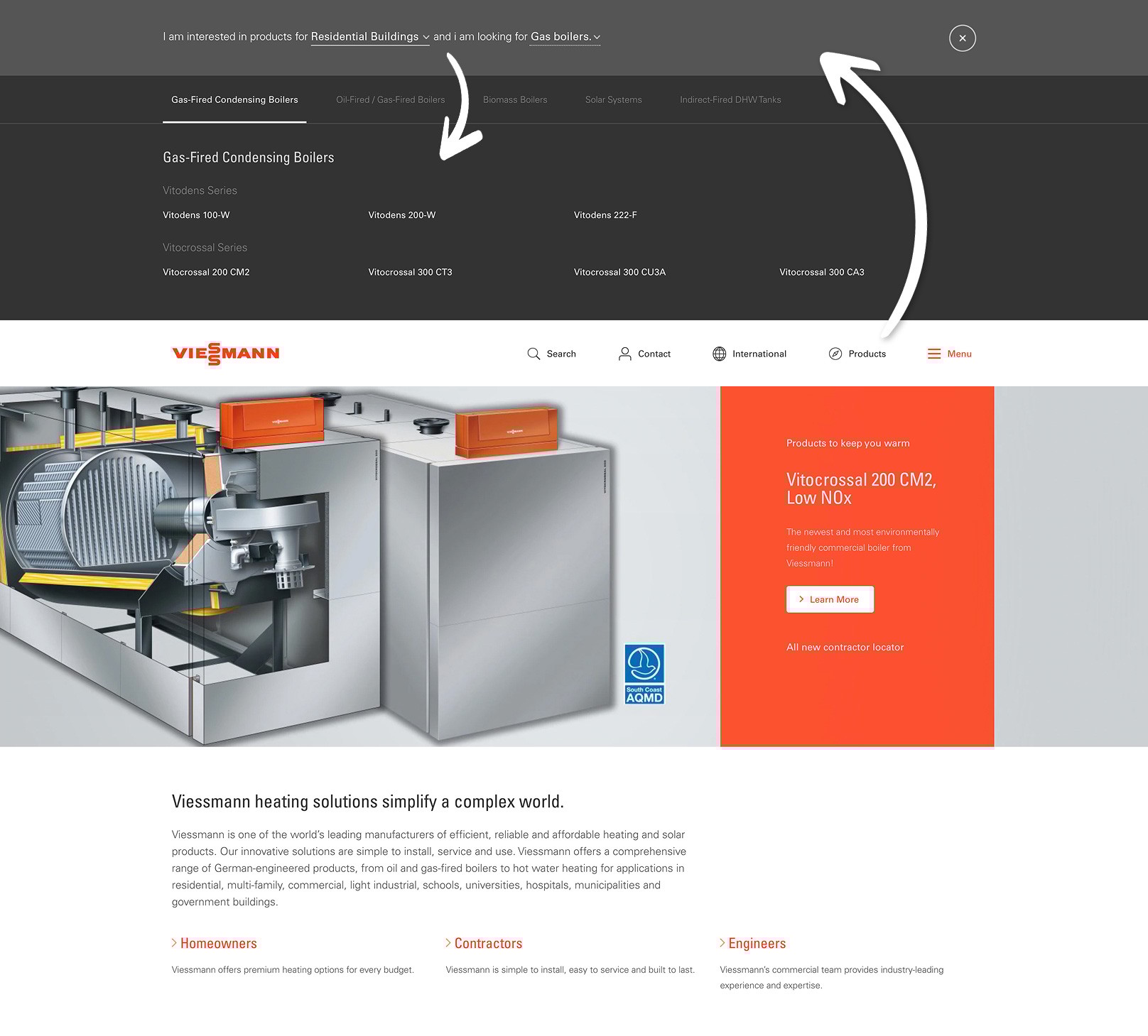
Awkward product catalogue access
A product catalogue existed in theory, but there was no way to just browse the products. The initial approach was to narrow down the search as much as possible - either through navigating multiple category pages or by using clumsy menu that folded out of the header. At the end there was only a list of product names.
The solution
To solve all the numerous problems, we needed a good strategy and a scalable solution that would be able to roll out everything across all the 40+ country websites.
Unified core components and design system
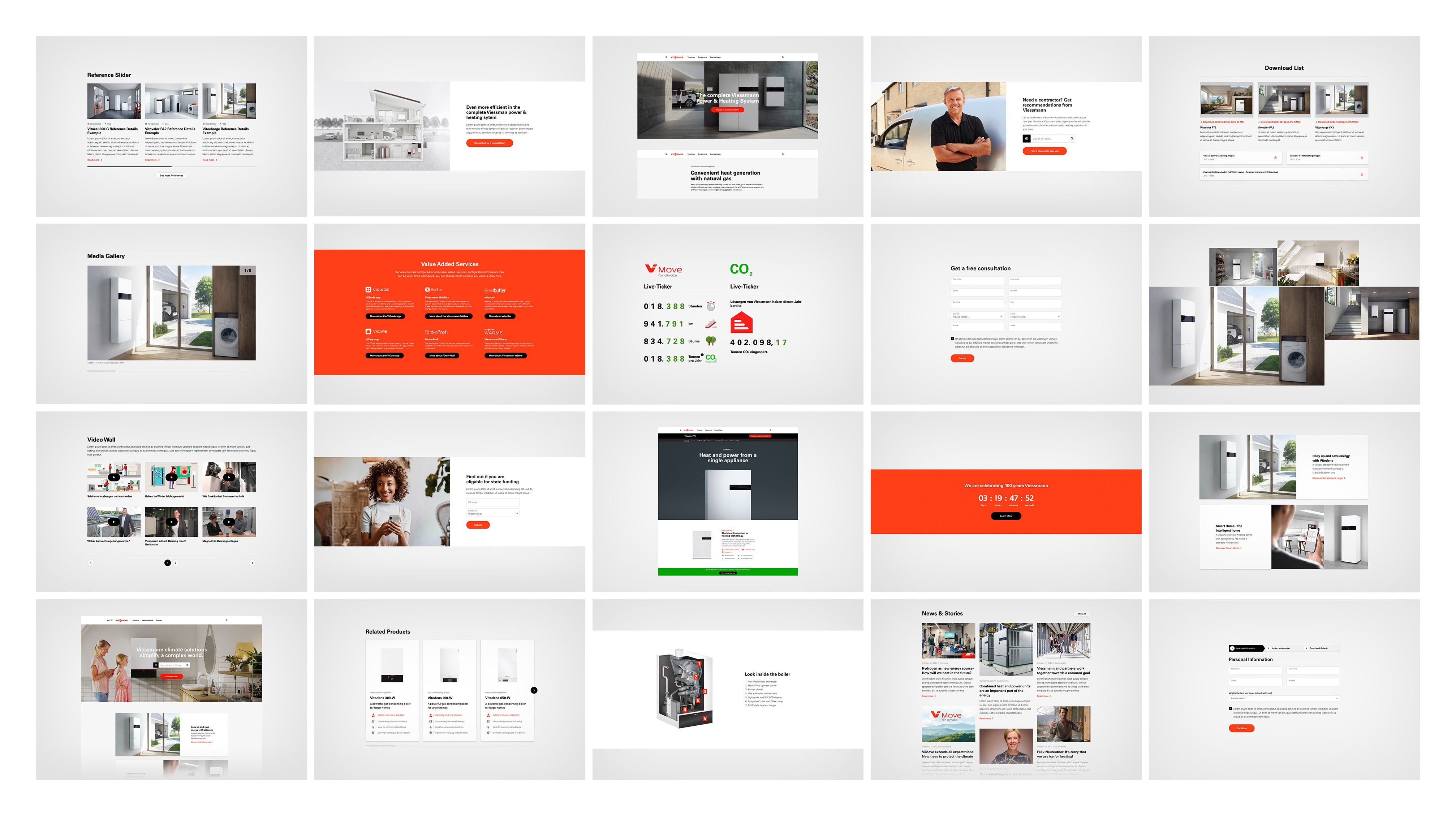
The first task was to create over 50 component templates for the website builder, designed so that even users without a design background could easily add text, images, or videos while maintaining a consistent, brand-compliant look.
During this process, I also built the design system from scratch, including the font and icon libraries. This gave us a strong understanding of the design language, which we then used to develop the more complex lead generation components.
Refining key user flows: Product Catalogue and Lead Gen Tools
Since we already had a solid design system in place, we skipped lo-fi wireframes and moved straight into high-fidelity prototyping. We began with internal testing, focusing on both desktop and smartphone touchpoints, with a strong emphasis on delivering a consistent user experience across devices. Using the Double Diamond method for each of the four core components, we refined our designs and later conducted a brief round of external user testing to validate our solutions. The prototypes closely resembled the final product and served as a valuable reference for the development team.
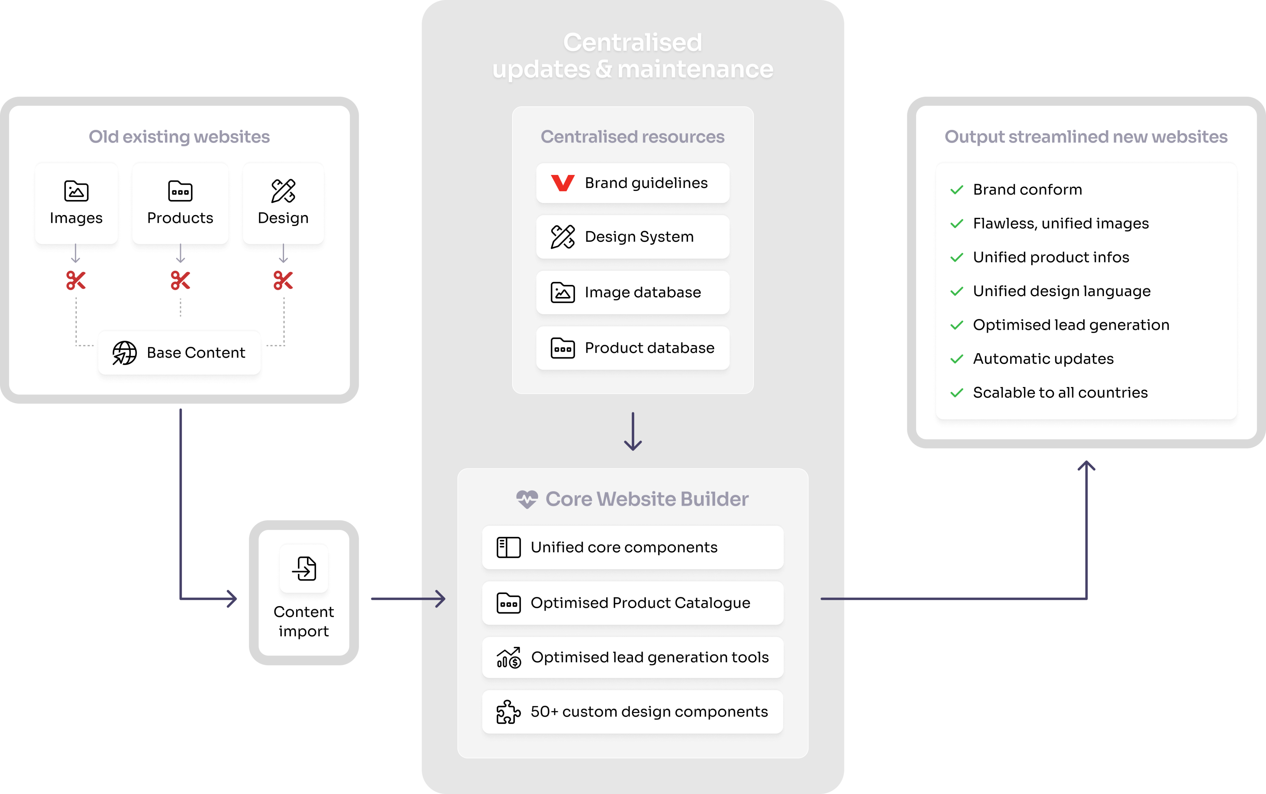
Centralised website builder with centralised resources
We developed a centralised website builder with a shared database for images and product information. To ensure global consistency, we created reusable components and templates that followed brand guidelines while giving editors the flexibility to create content. Extensive UX research helped improve key lead generation features for the main navigation, product catalogue, product finder, and installer finder.
Not just responsive, but a 100% identical experience across all devices
It's important to me that the user experience feels identical on all devices, whether you're on a phone, tablet, or desktop. I believe people shouldn't have to re-learn how to use an interface just because they switch screens. A consistent experience makes things feel more natural, saves time, and helps users stay focused on what they came to do.
The outcome
The user-centered redesign of the product catalog and installer finder significantly improved usability, resulting in a substantial increase in lead generation. In November 2022, Viessmann Germany received the Contentspace DX Award for "Best New Website / Website Redesign." Aggregating all websites into one central system and integrating former microsites into the main website positively impacted the company's web KPIs by boosting organic page views, increasing leads, and reducing the bounce rate.
The cherry on top
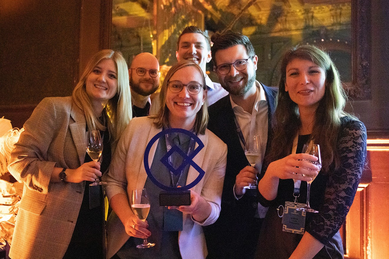
We won the Contentspace DX Award for "Best Redesign."
In November 2022, Viessmann Germany received the Contentspace DX Award for "Best New Website / Website Redesign." for the main product we created together.
In summary
The user-centered redesign of the product catalog and installer finder significantly improved usability, resulting in a substantial increase in lead generation. In November 2022, Viessmann Germany received the Contentspace DX Award for "Best New Website / Website Redesign." Aggregating all websites into one central system and integrating former microsites into the main website positively impacted the company's web KPIs by boosting organic page views, increasing leads, and reducing the bounce rate.
Key wins

Award-winning design

Dramatically improved usability and up to 300% more conversions
Cohesive brand experience across all 40+ websites
Go to the live site


Related projects
Case Study
Encore Live Performances
Discover how i changed my client’s business model and turned a good idea into a great one. My new value proposition paired with a super high fidelity prototype helped land the investor buy-in.
Check it out

Showcase
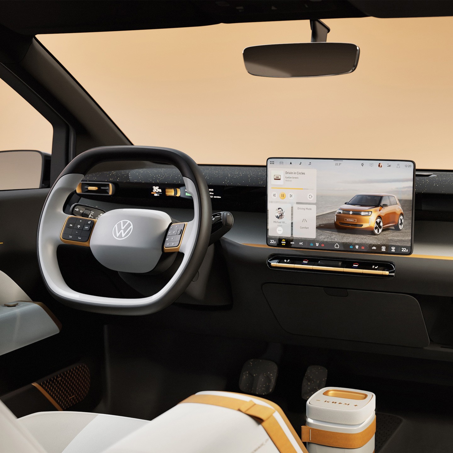
Volkswagen HMI Design
I was part of two design teams. First i worked on an Infotainment System tailored for the Chinese market. Later i moved over to the HMI design team for the series production in their entire fleet.
Check it out
Ready to take your design to the next level?
Let’s make it happen


© 2025 Mathias Mahling -
Impressum & Datenschutz

Case Study // 2022
How i crafted Viessmann’s redesign that won them an award
Viessmann hired me as one-man-show Lead Product Designer to build a flexible web toolkit that anyone in their 43 market countries could use to create beautiful, flexible, yet brand-consistent websites.
The client
About Viessmann
The Viessmann Group is a German company that manufactures heating and cooling systems. They have 22 factories in 12 countries and sell their products in 74 countries through sales offices, agencies, and partners around the world.
The project
Over 2.5 years, we redesigned Viessmann’s websites for 4 countries. We started with an MVP for the UK, which we used for extensive user testing on a live product. Insights from this launch helped us create a significantly improved version for the USA and Canada. We then fine-tuned everything further to deliver the final, optimised version for Viessmann’s key market: Germany.
My role and my responsibilities
As the only UX/UI designer, I was responsible for all user research, wireframing, prototyping, and user testing. I designed around 30 page templates that served as a reference for content editors and built the entire design system from scratch, continuously updating it. I wrote comprehensive documentation for developers, closely supported the development process, and handled quality assurance by testing all final components. Additionally, I created a detailed online user guide to help editors effectively use the components I designed.
Main tools


The initial problems
Since we were essentially redesigning 40+ different websites in 40+ different countries, there was a whole multitude of problems that all needed resolving. Here i will only outline a few of the biggest ones.
General design inconsistency across the 40+ different websites
Viessmann’s website ecosystem was complex and fragmented. Each country created its own content and assets, often without design support, leading to inconsistent quality. There were multiple separate websites for B2B, B2C, and product-specific microsites, all with different priorities. For users, it was difficult to find and understand product information, and installers spent too much time searching for technical details.
Overloaded menu
There was a general lack of structure and consistency on Viessmann’s old website. Being a large company with many different branches - the amount of content they had to handle outgrew their old menu structure and made it hard to find anything.
Awkward product catalogue access
A product catalogue existed in theory, but there was no way to just browse the products. The initial approach was to narrow down the search as much as possible - either through navigating multiple category pages or by using clumsy menu that folded out of the header. At the end there was only a list of product names.
The solution
To solve all the numerous problems, we needed a good strategy and a scalable solution that would be able to roll out everything across all the 40+ country websites.
Unified core components and design system
The first task was to create over 50 component templates for the website builder, designed so that even users without a design background could easily add text, images, or videos while maintaining a consistent, brand-compliant look.
During this process, I also built the design system from scratch, including the font and icon libraries. This gave us a strong understanding of the design language, which we then used to develop the more complex lead generation components.
Refining key user flows: Product Catalogue and Lead Gen Tools
Since we already had a solid design system in place, we skipped lo-fi wireframes and moved straight into high-fidelity prototyping. We began with internal testing, focusing on both desktop and smartphone touchpoints, with a strong emphasis on delivering a consistent user experience across devices. Using the Double Diamond method for each of the four core components, we refined our designs and later conducted a brief round of external user testing to validate our solutions. The prototypes closely resembled the final product and served as a valuable reference for the development team.
Centralised website builder with centralised resources
We developed a centralised website builder with a shared database for images and product information. To ensure global consistency, we created reusable components and templates that followed brand guidelines while giving editors the flexibility to create content. Extensive UX research helped improve key lead generation features for the main navigation, product catalogue, product finder, and installer finder.
Not just responsive, but a 100% identical experience across all devices
It's important to me that the user experience feels identical on all devices, whether you're on a phone, tablet, or desktop. I believe people shouldn't have to re-learn how to use an interface just because they switch screens. A consistent experience makes things feel more natural, saves time, and helps users stay focused on what they came to do.
The outcome
The user-centered redesign of the product catalog and installer finder significantly improved usability, resulting in a substantial increase in lead generation. In November 2022, Viessmann Germany received the Contentspace DX Award for "Best New Website / Website Redesign." Aggregating all websites into one central system and integrating former microsites into the main website positively impacted the company's web KPIs by boosting organic page views, increasing leads, and reducing the bounce rate.
The cherry on top
We won the Contentspace DX Award for "Best Redesign."
In November 2022, Viessmann Germany received the Contentspace DX Award for "Best New Website / Website Redesign." for the main product we created together.
In summary
The user-centered redesign of the product catalog and installer finder significantly improved usability, resulting in a substantial increase in lead generation. In November 2022, Viessmann Germany received the Contentspace DX Award for "Best New Website / Website Redesign." Aggregating all websites into one central system and integrating former microsites into the main website positively impacted the company's web KPIs by boosting organic page views, increasing leads, and reducing the bounce rate.
Key wins
Award-winning design
Dramatically improved usability and up to 300% more conversions
Cohesive brand experience across all 40+ websites
Go to the live site
Related projects
Case Study
Encore Live Performances
Discover how i changed my client’s business model and turned a good idea into a great one. My new value proposition paired with a super high fidelity prototype helped land the investor buy-in.
Check it out
Showcase
Volkswagen HMI Design
I was part of two design teams. First i worked on an Infotainment System tailored for the Chinese market. Later i moved over to the HMI design team for the series production in their entire fleet.
Check it out
Ready to take your design to the next level?
Let’s make it happen

© 2025 Mathias Mahling -
Impressum & Datenschutz
Case Study // 2022
How i crafted Viessmann’s redesign that won them an award
Viessmann hired me as one-man-show Lead Product Designer to build a flexible web toolkit that anyone in their 43 market countries could use to create beautiful, flexible, yet brand-consistent websites.
The client
About Viessmann
The Viessmann Group is a German company that manufactures heating and cooling systems. They have 22 factories in 12 countries and sell their products in 74 countries through sales offices, agencies, and partners around the world.
The project
Over 2.5 years, we redesigned Viessmann’s websites for 4 countries. We started with an MVP for the UK, which we used for extensive user testing on a live product. Insights from this launch helped us create a significantly improved version for the USA and Canada. We then fine-tuned everything further to deliver the final, optimised version for Viessmann’s key market: Germany.
My role and my responsibilities
As the only UX/UI designer, I was responsible for all user research, wireframing, prototyping, and user testing. I designed around 30 page templates that served as a reference for content editors and built the entire design system from scratch, continuously updating it. I wrote comprehensive documentation for developers, closely supported the development process, and handled quality assurance by testing all final components. Additionally, I created a detailed online user guide to help editors effectively use the components I designed.
Main tools


The initial problems
Since we were essentially redesigning 40+ different websites in 40+ different countries, there was a whole multitude of problems that all needed resolving. Here i will only outline a few of the biggest ones.
General design inconsistency across the 40+ different websites
Viessmann’s website ecosystem was complex and fragmented. Each country created its own content and assets, often without design support, leading to inconsistent quality. There were multiple separate websites for B2B, B2C, and product-specific microsites, all with different priorities. For users, it was difficult to find and understand product information, and installers spent too much time searching for technical details.
Overloaded menu
There was a general lack of structure and consistency on Viessmann’s old website. Being a large company with many different branches - the amount of content they had to handle outgrew their old menu structure and made it hard to find anything.
Awkward product catalogue access
A product catalogue existed in theory, but there was no way to just browse the products. The initial approach was to narrow down the search as much as possible - either through navigating multiple category pages or by using clumsy menu that folded out of the header. At the end there was only a list of product names.
The solution
To solve all the numerous problems, we needed a good strategy and a scalable solution that would be able to roll out everything across all the 40+ country websites.
Unified core components and design system
The first task was to create over 50 component templates for the website builder, designed so that even users without a design background could easily add text, images, or videos while maintaining a consistent, brand-compliant look.
During this process, I also built the design system from scratch, including the font and icon libraries. This gave us a strong understanding of the design language, which we then used to develop the more complex lead generation components.
Refining key user flows: Product Catalogue and Lead Gen Tools
Since we already had a solid design system in place, we skipped lo-fi wireframes and moved straight into high-fidelity prototyping. We began with internal testing, focusing on both desktop and smartphone touchpoints, with a strong emphasis on delivering a consistent user experience across devices. Using the Double Diamond method for each of the four core components, we refined our designs and later conducted a brief round of external user testing to validate our solutions. The prototypes closely resembled the final product and served as a valuable reference for the development team.
Centralised website builder with centralised resources
We developed a centralised website builder with a shared database for images and product information. To ensure global consistency, we created reusable components and templates that followed brand guidelines while giving editors the flexibility to create content. Extensive UX research helped improve key lead generation features for the main navigation, product catalogue, product finder, and installer finder.
Not just responsive, but a 100% identical experience across all devices
It's important to me that the user experience feels identical on all devices, whether you're on a phone, tablet, or desktop. I believe people shouldn't have to re-learn how to use an interface just because they switch screens. A consistent experience makes things feel more natural, saves time, and helps users stay focused on what they came to do.
The outcome
The user-centered redesign of the product catalog and installer finder significantly improved usability, resulting in a substantial increase in lead generation. In November 2022, Viessmann Germany received the Contentspace DX Award for "Best New Website / Website Redesign." Aggregating all websites into one central system and integrating former microsites into the main website positively impacted the company's web KPIs by boosting organic page views, increasing leads, and reducing the bounce rate.
The cherry on top
We won the Contentspace DX Award for "Best Redesign."
In November 2022, Viessmann Germany received the Contentspace DX Award for "Best New Website / Website Redesign." for the main product we created together.
In summary
The user-centered redesign of the product catalog and installer finder significantly improved usability, resulting in a substantial increase in lead generation. In November 2022, Viessmann Germany received the Contentspace DX Award for "Best New Website / Website Redesign." Aggregating all websites into one central system and integrating former microsites into the main website positively impacted the company's web KPIs by boosting organic page views, increasing leads, and reducing the bounce rate.
Key wins
Award-winning design
Dramatically improved usability and up to 300% more conversions
Cohesive brand experience across all 40+ websites
Go to the live site
Related projects
Case Study
Encore Live Performances
Discover how i changed my client’s business model and turned a good idea into a great one. My new value proposition paired with a super high fidelity prototype helped land the investor buy-in.
Check it out
Showcase
Volkswagen HMI Design
I was part of two design teams. First i worked on an Infotainment System tailored for the Chinese market. Later i moved over to the HMI design team for the series production in their entire fleet.
Check it out
Ready to take your design to the next level?
Let’s make it happen
© 2025 Mathias Mahling -
Impressum & Datenschutz

Case Study // 2022
How i crafted Viessmann’s redesign that won them an award
Viessmann hired me as one-man-show Lead Product Designer to build a flexible web toolkit that anyone in their 43 market countries could use to create beautiful, flexible, yet brand-consistent websites.
The client
About Viessmann
The Viessmann Group is a German company that manufactures heating and cooling systems. They have 22 factories in 12 countries and sell their products in 74 countries through sales offices, agencies, and partners around the world.
The project
Over 2.5 years, we redesigned Viessmann’s websites for 4 countries. We started with an MVP for the UK, which we used for extensive user testing on a live product. Insights from this launch helped us create a significantly improved version for the USA and Canada. We then fine-tuned everything further to deliver the final, optimised version for Viessmann’s key market: Germany.
My role and my responsibilities
As the only UX/UI designer, I was responsible for all user research, wireframing, prototyping, and user testing. I designed around 30 page templates that served as a reference for content editors and built the entire design system from scratch, continuously updating it. I wrote comprehensive documentation for developers, closely supported the development process, and handled quality assurance by testing all final components. Additionally, I created a detailed online user guide to help editors effectively use the components I designed.
Main tools

The initial problems
Since we were essentially redesigning 40+ different websites in 40+ different countries, there was a whole multitude of problems that all needed resolving. Here i will only outline a few of the biggest ones.
General design inconsistency across the 40+ different websites
Viessmann’s website ecosystem was complex and fragmented. Each country created its own content and assets, often without design support, leading to inconsistent quality. There were multiple separate websites for B2B, B2C, and product-specific microsites, all with different priorities. For users, it was difficult to find and understand product information, and installers spent too much time searching for technical details.
Overloaded menu
There was a general lack of structure and consistency on Viessmann’s old website. Being a large company with many different branches - the amount of content they had to handle outgrew their old menu structure and made it hard to find anything.
Awkward product catalogue access
A product catalogue existed in theory, but there was no way to just browse the products. The initial approach was to narrow down the search as much as possible - either through navigating multiple category pages or by using clumsy menu that folded out of the header. At the end there was only a list of product names.
The solution
To solve all the numerous problems, we needed a good strategy and a scalable solution that would be able to roll out everything across all the 40+ country websites.
Unified core components and design system
The first task was to create over 50 component templates for the website builder, designed so that even users without a design background could easily add text, images, or videos while maintaining a consistent, brand-compliant look.
During this process, I also built the design system from scratch, including the font and icon libraries. This gave us a strong understanding of the design language, which we then used to develop the more complex lead generation components.
Refining key user flows: Product Catalogue and Lead Gen Tools
Since we already had a solid design system in place, we skipped lo-fi wireframes and moved straight into high-fidelity prototyping. We began with internal testing, focusing on both desktop and smartphone touchpoints, with a strong emphasis on delivering a consistent user experience across devices. Using the Double Diamond method for each of the four core components, we refined our designs and later conducted a brief round of external user testing to validate our solutions. The prototypes closely resembled the final product and served as a valuable reference for the development team.
Centralised website builder with centralised resources
We developed a centralised website builder with a shared database for images and product information. To ensure global consistency, we created reusable components and templates that followed brand guidelines while giving editors the flexibility to create content. Extensive UX research helped improve key lead generation features for the main navigation, product catalogue, product finder, and installer finder.
Not just responsive, but a 100% identical experience across all devices
It's important to me that the user experience feels identical on all devices, whether you're on a phone, tablet, or desktop. I believe people shouldn't have to re-learn how to use an interface just because they switch screens. A consistent experience makes things feel more natural, saves time, and helps users stay focused on what they came to do.
The outcome
The user-centered redesign of the product catalog and installer finder significantly improved usability, resulting in a substantial increase in lead generation. Aggregating all websites into one central system and integrating former microsites into the main website positively impacted the company's web KPIs by boosting organic page views, increasing leads, and reducing the bounce rate.
The cherry on top
We won the Contentspace DX Award for "Best Redesign."
In November 2022, Viessmann Germany received the Contentspace DX Award for "Best New Website / Website Redesign." for the main product we created together.
In summary
I led the redesign of Viessmann’s digital ecosystem—streamlining UX, modernising the visual identity, and unifying their platform architecture. The result? A sleeker, more intuitive experience that boosted engagement, improved conversion, and won an industry award for design excellence. By balancing innovation with brand heritage, the project elevated Viessmann’s position as a leader in sustainable heating solutions.
Key wins
Award-winning design
Dramatically improved usability and up to 300% more conversions
Cohesive brand experience across all 40+ websites
Go to the live site
Related projects
Case Study
Encore Live Performances
Discover how i changed my client’s business model and turned a good idea into a great one. My new value proposition paired with a super high fidelity prototype helped land the investor buy-in.
Check it out
Showcase
Volkswagen HMI Design
I was part of two design teams. First i worked on an Infotainment System tailored for the Chinese market. Later i moved over to the HMI design team for the series production in their entire fleet.
Check it out
Ready to take your design to the next level?
Let’s make it happen

© 2025 Mathias Mahling -
Impressum & Datenschutz
Case Study // 2022
How i crafted Viessmann’s redesign that won them an award
Viessmann hired me as one-man-show Lead Product Designer to build a flexible web toolkit that anyone in their 43 market countries could use to create beautiful, flexible, yet brand-consistent websites.
The client
About Viessmann
The Viessmann Group is a German company that manufactures heating and cooling systems. They have 22 factories in 12 countries and sell their products in 74 countries through sales offices, agencies, and partners around the world.
The project
Over 2.5 years, we redesigned Viessmann’s websites for 4 countries. We started with an MVP for the UK, which we used for extensive user testing on a live product. Insights from this launch helped us create a significantly improved version for the USA and Canada. We then fine-tuned everything further to deliver the final, optimised version for Viessmann’s key market: Germany.
My role and my responsibilities
As the only UX/UI designer, I was responsible for all user research, wireframing, prototyping, and user testing. I designed around 30 page templates that served as a reference for content editors and built the entire design system from scratch, continuously updating it. I wrote comprehensive documentation for developers, closely supported the development process, and handled quality assurance by testing all final components. Additionally, I created a detailed online user guide to help editors effectively use the components I designed.
Main tools

The initial problems
Since we were essentially redesigning 40+ different websites in 40+ different countries, there was a whole multitude of problems that all needed resolving. Here i will only outline a few of the biggest ones.
General design inconsistency across the 40+ different websites
Viessmann’s website ecosystem was complex and fragmented. Each country created its own content and assets, often without design support, leading to inconsistent quality. There were multiple separate websites for B2B, B2C, and product-specific microsites, all with different priorities. For users, it was difficult to find and understand product information, and installers spent too much time searching for technical details.
Overloaded menu
There was a general lack of structure and consistency on Viessmann’s old website. Being a large company with many different branches - the amount of content they had to handle outgrew their old menu structure and made it hard to find anything.
Awkward product catalogue access
A product catalogue existed in theory, but there was no way to just browse the products. The initial approach was to narrow down the search as much as possible - either through navigating multiple category pages or by using clumsy menu that folded out of the header. At the end there was only a list of product names.
The solution
To solve all the numerous problems, we needed a good strategy and a scalable solution that would be able to roll out everything across all the 40+ country websites.
Unified core components and design system
The first task was to create over 50 component templates for the website builder, designed so that even users without a design background could easily add text, images, or videos while maintaining a consistent, brand-compliant look.
During this process, I also built the design system from scratch, including the font and icon libraries. This gave us a strong understanding of the design language, which we then used to develop the more complex lead generation components.
Refining key user flows: Product Catalogue and Lead Gen Tools
Since we already had a solid design system in place, we skipped lo-fi wireframes and moved straight into high-fidelity prototyping. We began with internal testing, focusing on both desktop and smartphone touchpoints, with a strong emphasis on delivering a consistent user experience across devices. Using the Double Diamond method for each of the four core components, we refined our designs and later conducted a brief round of external user testing to validate our solutions. The prototypes closely resembled the final product and served as a valuable reference for the development team.
Centralised website builder with centralised resources
We developed a centralised website builder with a shared database for images and product information. To ensure global consistency, we created reusable components and templates that followed brand guidelines while giving editors the flexibility to create content. Extensive UX research helped improve key lead generation features for the main navigation, product catalogue, product finder, and installer finder.
Not just responsive, but a 100% identical experience across all devices
It's important to me that the user experience feels identical on all devices, whether you're on a phone, tablet, or desktop. I believe people shouldn't have to re-learn how to use an interface just because they switch screens. A consistent experience makes things feel more natural, saves time, and helps users stay focused on what they came to do.
The outcome
The user-centered redesign of the product catalog and installer finder significantly improved usability, resulting in a substantial increase in lead generation. Aggregating all websites into one central system and integrating former microsites into the main website positively impacted the company's web KPIs by boosting organic page views, increasing leads, and reducing the bounce rate.
The cherry on top
We won the Contentspace DX Award for "Best Redesign."
In November 2022, Viessmann Germany received the Contentspace DX Award for "Best New Website / Website Redesign." for the main product we created together.
In summary
I led the redesign of Viessmann’s digital ecosystem—streamlining UX, modernising the visual identity, and unifying their platform architecture. The result? A sleeker, more intuitive experience that boosted engagement, improved conversion, and won an industry award for design excellence. By balancing innovation with brand heritage, the project elevated Viessmann’s position as a leader in sustainable heating solutions.
Key wins
Award-winning design
Dramatically improved usability and up to 300% more conversions
Cohesive brand experience across all 40+ websites
Go to the live site
Related projects
Case Study
Encore Live Performances
Discover how i changed my client’s business model and turned a good idea into a great one. My new value proposition paired with a super high fidelity prototype helped land the investor buy-in.
Check it out
Showcase
Volkswagen HMI Design
I was part of two design teams. First i worked on an Infotainment System tailored for the Chinese market. Later i moved over to the HMI design team for the series production in their entire fleet.
Check it out
Ready to take your design to the next level?
Let’s make it happen
© 2025 Mathias Mahling -
Impressum & Datenschutz